Exercise 1.3: Sex determination
In the following exercise, we are executing R commands. You can do one of two things to run them yourself:
- Copy each command (for example using the little copy-icon on the right in each code-chunk) and paste them into the R console (the “Console” tab in the lower left pane on RStudio), then press
<Enter>. - Open this exercise in RStudio, by going to the “Files” tab in the lower right in RStudio, clicking on
exercisesand then onexercise_1_3_sex_determination.qmd. You should then see little green arrows beside each code-chunk. Click on them, and they are automatically executed in the Console.
Let’s start by loading a data table into memory:
dat <- readr::read_tsv("data/SexDet.txt", col_types = "ciiiiii")Let’s view the dataset by simply typing its name:
dat# A tibble: 35 × 7
Sample TotalAut TotalX TotalY NrAut NrX NrY
<chr> <int> <int> <int> <int> <int> <int>
1 SAMPLE4 1150639 49704 32670 1708520 30367 25196
2 SAMPLE8 1150639 49704 32670 8774 156 104
3 SAMPLE9 1150639 49704 32670 1299329 46274 341
4 SAMPLE12 1150639 49704 32670 867988 30079 216
5 SAMPLE13 1150639 49704 32670 541696 19214 122
6 SAMPLE14 1150639 49704 32670 2386212 41339 33781
7 SAMPLE15 1150639 49704 32670 412062 7074 6077
8 SAMPLE17 1150639 49704 32670 1670276 29177 23905
9 SAMPLE19 1150639 49704 32670 1599366 27127 21984
10 SAMPLE22 1150639 49704 32670 259069 9302 64
# … with 25 more rows
# ℹ Use `print(n = ...)` to see more rowsTask: Interactively explore the dataset, by clicking on “dat” in the “Environment” tab in the upper right pane in RStudio.
Here is an explanation for the columns:
- Sample - The name of the sample
- TotalAut - The total number of autosomal positions analysed (chromosomes 1-22)
- TotalX - The total number of X-chromosomal positions analysed
- TotalY - The total number of Y-chromosomal positions analysed
- NrAut - The total number of reads mapping to the autosomal positions
- NrX - The total number of reads mapping to the X-chromosomal positions
- NrY - The total number of reads mapping to the Y-chromosomal positions
Let’s try a first simple plot. We first need to load the ggplot2 library, and while we’re at it, we also load the magrittr library to have the pipe operator %>% available for later. Execute the following code in the Console:
library(ggplot2)
library(magrittr)

ggplot(dat) + geom_point(aes(x = NrAut, y = NrX))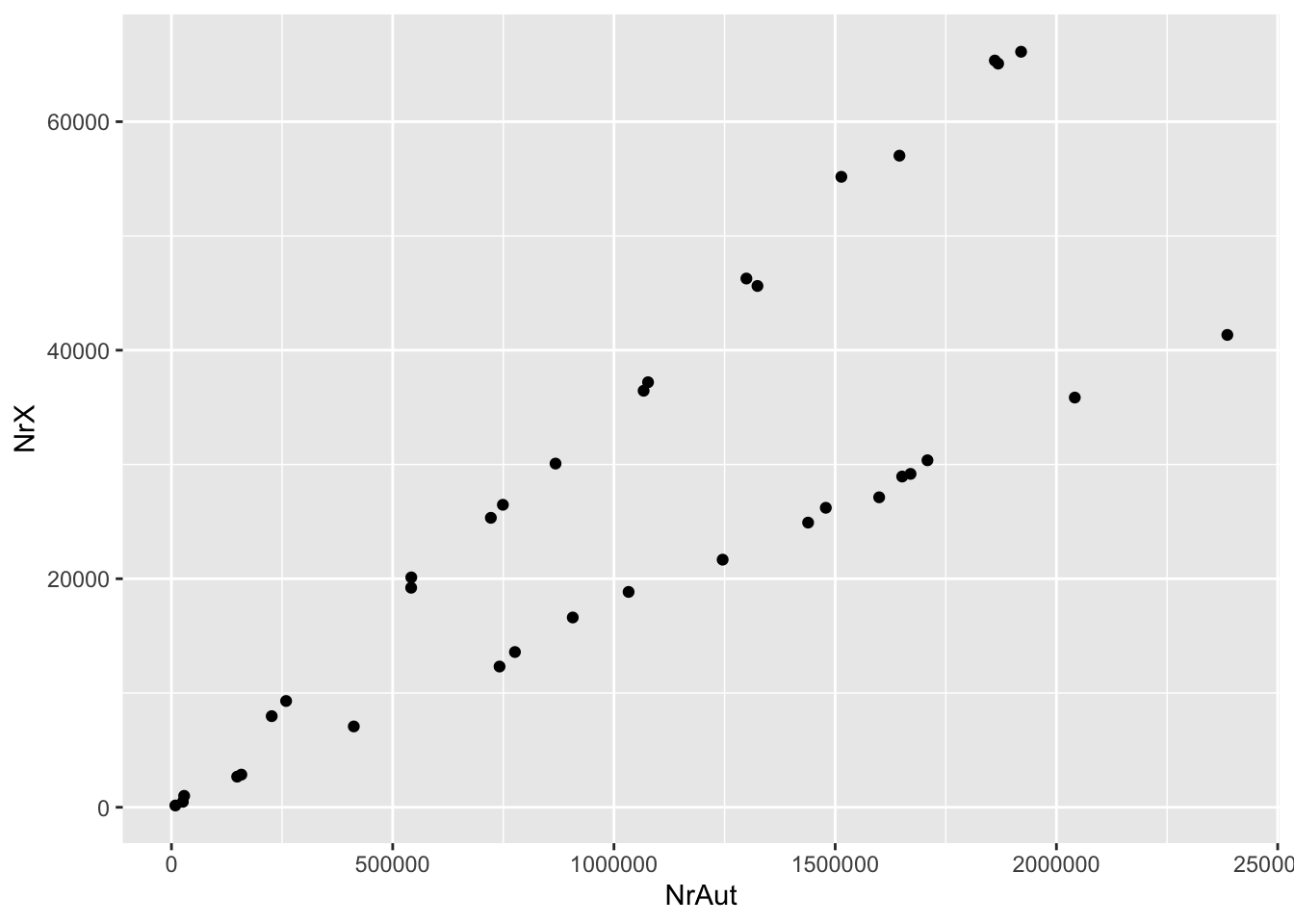
Question: Do you have an idea why there are two lines?
Task: You can always execute a previous command in the R console by clicking the up-arrow key. Use it to get the plotting command, and then play around with this code a bit. For example, change the code so that you’re plotting NrY (and not NrX) against NrAut, and also NrX vs NrY. Do you understand what you’re seeing?
Of course, the three categories, X, Y and Autosomes have vastly different sizes. In order to compare the numbers, we need to convert them to something like “average coverage”, which we achieve by normalising the read numbers by the total number of analysed positions in each category. Here is a command that adds this normalisation, execute it in the console:
dat2 <- dat %>%
  dplyr::mutate(
    covAut = NrAut / TotalAut,
    covX   = NrX   / TotalX,
    covY   = NrY   / TotalY
)Task: View the new dataset by clicking on dat2 in the Environment-tab in RStudio.
The number of reads mapping to different chromosomes (the variables starting with Nr) are critically dependant on genomic coverage: The more human fragments have been sequenced, the higher the numbers in these variables.
We can now again try our simple plot from above, this time using dat2 and the cov... variables. Execute the following:
ggplot(dat2) + geom_point(aes(x = covAut, y = covX))
Task: Again use the up-arrow to play again with this plot, and change the axes by choosing two variables from covAut, covX and covY. Not much has changed, besides the values on the axes, which now reflect genomic coverage instead of total number of reads.
There still is the problem that samples have vastly different coverages, simply due to different degrees of preservation and different sequencing depths (and some have undergone capture, some haven’t). How do we make these numbers comparable?
The easiest approach is to take the autosomal coverage to normalise the X and Y coverage on.
For example, here is the distribution of relative X-coverages:
ggplot(dat2) + geom_histogram(aes(x = covX / covAut))`stat_bin()` using `bins = 30`. Pick better value with `binwidth`.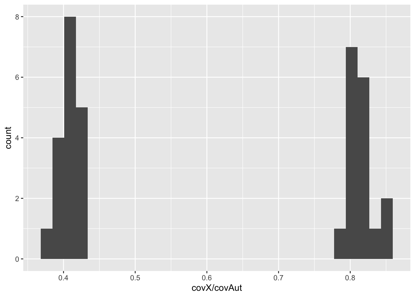
Task: Plot a second histogram with the relative Y coverage.
Task: Copy the code from the scatter plots above and plot relative X vs. relative Y coverage. Can you identify the males and female samples?